In this section we are going to talk abour how you can organize a dashboard. You can organize a dashboard if you are in the edit mode of the dashboard.
Organizing a dashboard is essential for presenting visualizations in a clear and coherent manner, allowing users to quickly understand key insights and make informed decisions. By structuring the dashboard with logical groupings using the row name feature, such as by topic, department, or metric, users can easily navigate through the information and find what they need efficiently.
How can you organize a Dashboard?
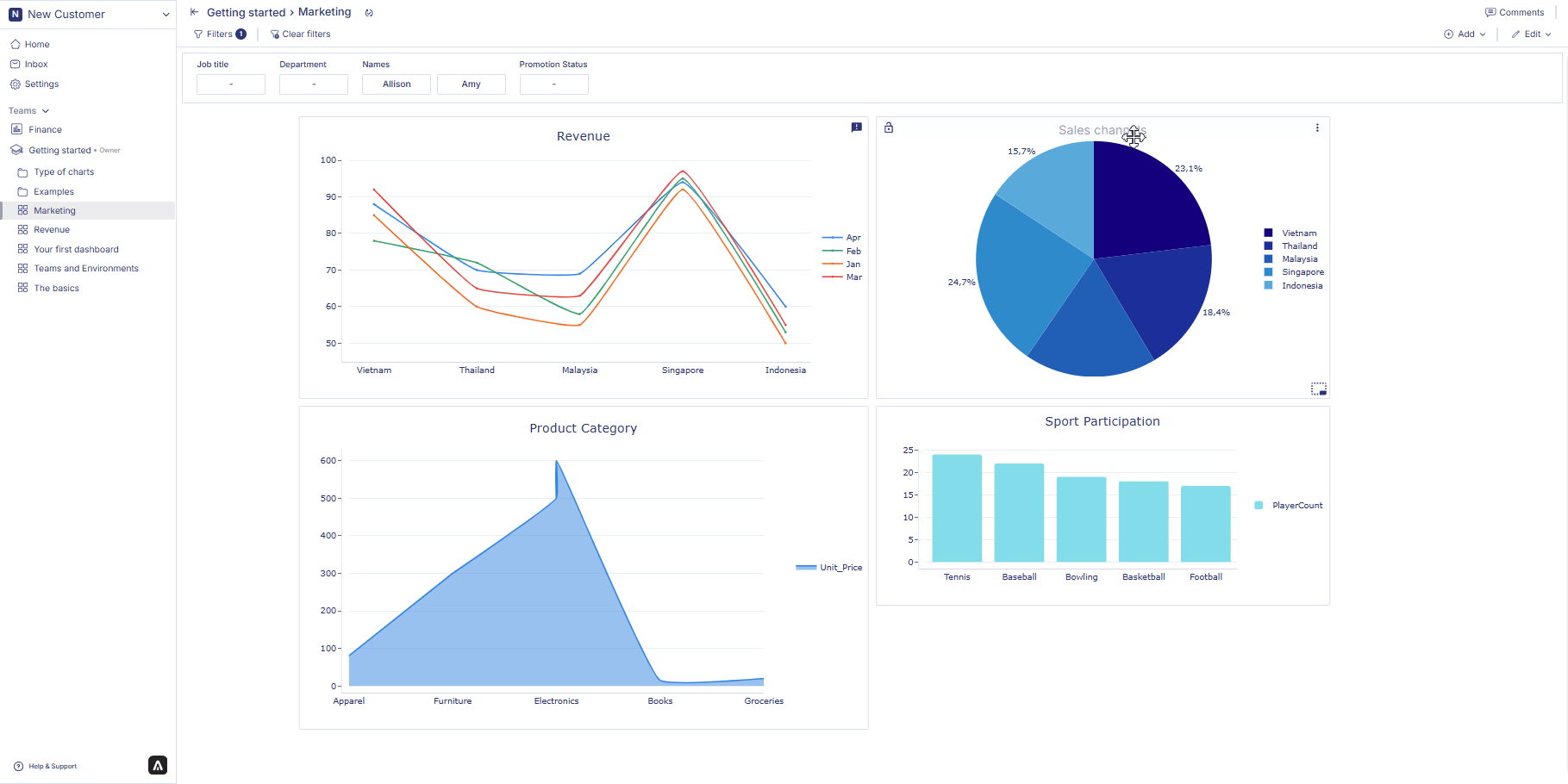
Let’s take an example of a sales report to demonstrate how you can organize a dashboard.
You plan to create a sales report. You want to divide the report into two sections. One section consists of sales performance metrics such as total revenue, units sold, sales growth along with sales trends and sales forecast. In the other section you want to see charts about sales team performance, competative analysis. For the first section you need charts that represents revenue, number of units sold, sales growth trend, and sales forecast chart. For the second section you need a chart for sales teams performance and an explaination for competative analysis.
You can organize the first section under one row which will include charts that shows revenue, number of units sold, sales growth trend, and sales forecast chart. You can name the first row as ‘Sales performance’. Then you can add another row to show the chart for sales teams performance and add a note continer to write an explaination for competative analysis. Below is an example of how an organized dashboard looks like.
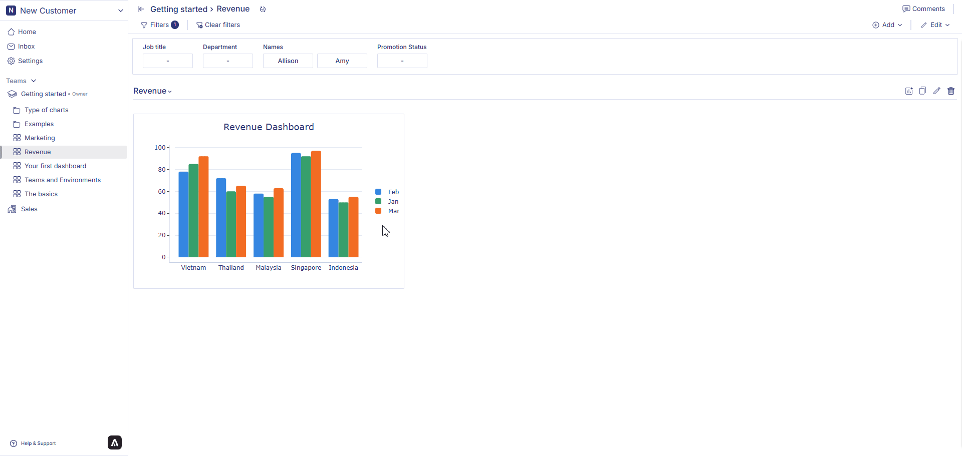
 If you want to change the position of a chart from one row to another, you can simply drag and drop the chart from one row to another row. You can also have charts without a row as well. Just simply drag and drop the chart above the first row.
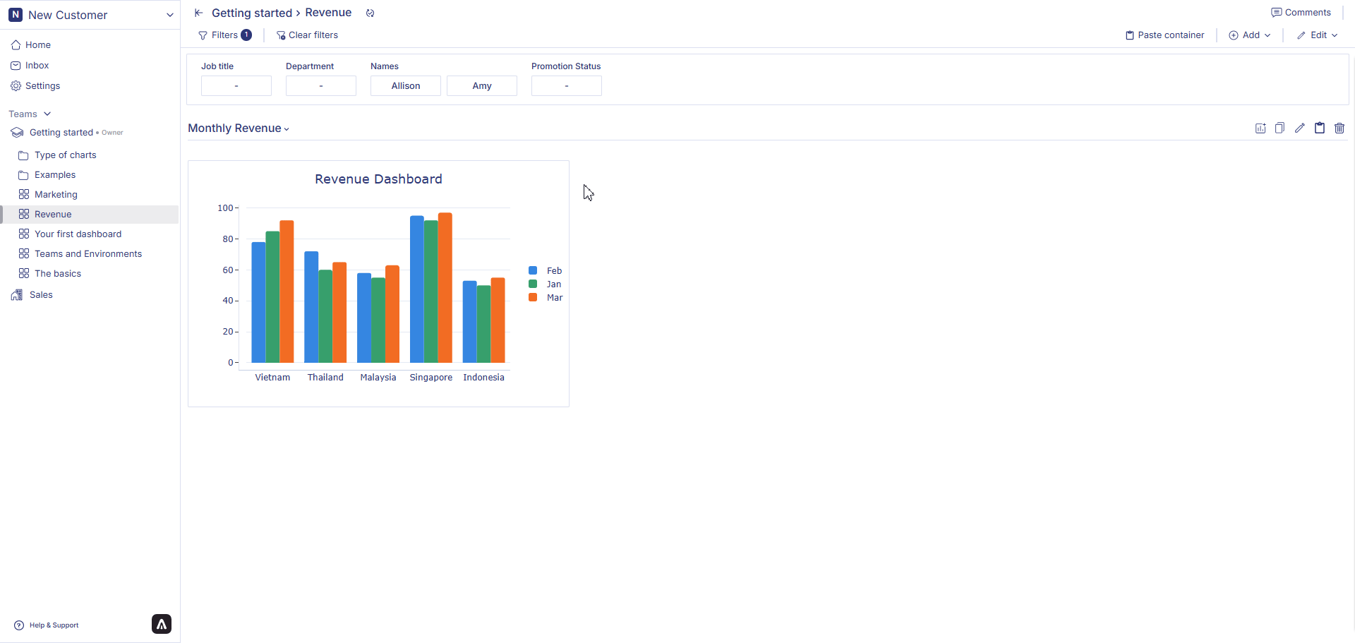
Resizing a chart is also very simple. To resize a chart, just hover over a container from the dashboard, click at the right hand side bottom corner of the container, drag your mouse downwards to make the chart bigger, drag your mouse upwards to make your charts smaller.
If you want to change the position of a chart from one row to another, you can simply drag and drop the chart from one row to another row. You can also have charts without a row as well. Just simply drag and drop the chart above the first row.
Resizing a chart is also very simple. To resize a chart, just hover over a container from the dashboard, click at the right hand side bottom corner of the container, drag your mouse downwards to make the chart bigger, drag your mouse upwards to make your charts smaller.
Copy & paste charts
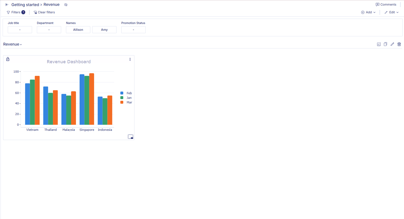
Hover over a chart container that you want to copy and click on the option menu (three dots) in the chart container. Click on the option copy. Click on the paste button at the right-hand corner on the row line.
Copy & paste rows
Click on Copy row. Click on the paste row button at the top right-hand corner of the dashboard besides add row button. Your copied row will be added to the dashboard.

Download charts or data
You can either download chart as .png file and download data related to the graph as .csv file. to do so, follow the following steps:
Hover over a chart container that you want to copy and click on the option menu (three dots) in the chart container. Click on the option download. Click on .png to download the chart as image or click on .csv to download the data related to the graph.
Lock a chart
Loocking a chart allows you to have more control over a chart. if you lock a chart and apply filter to the whole dashboard, that filter will not be applied to that chat.
To lock a chart, hover over its title until the lock icon appears on the left side of the title bar, then click the lock icon to lock the chart. To unlock the chart, click the lock icon again whenever you need to revert it to an editable state
 Now that we have learned about types of charts in Anlytic platform, lets walk you through how you can create those charts in the next chapter.
 Last modified on March 13, 2026