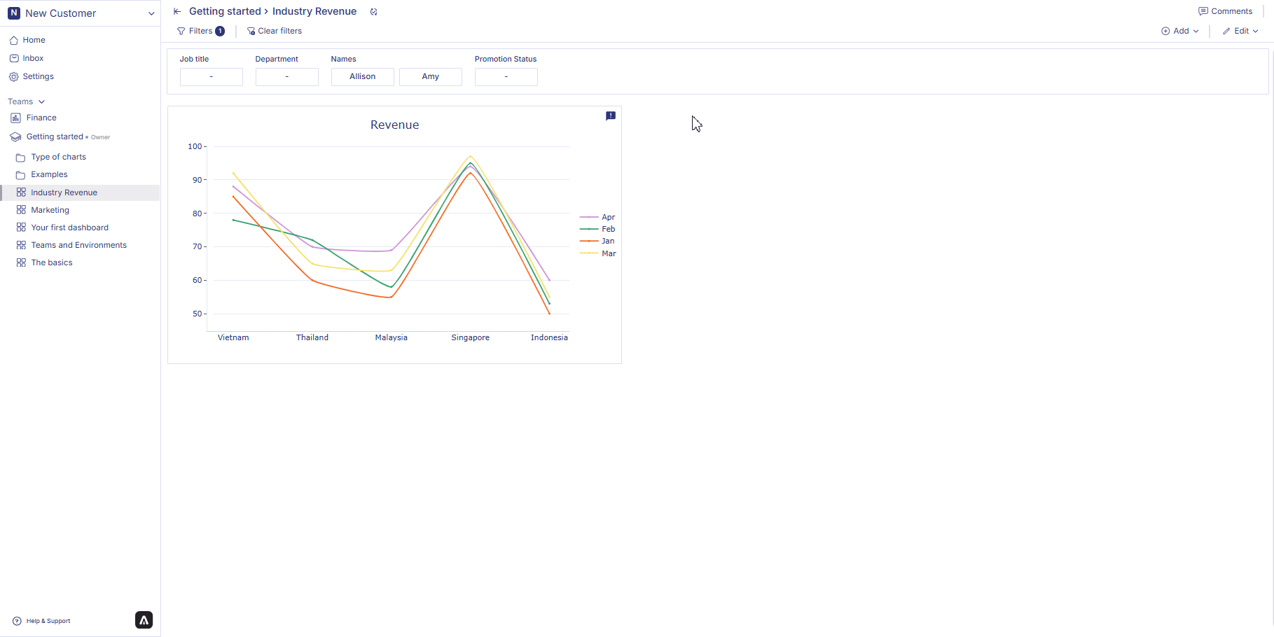
Point chart
Point charts are useful for visualizing trends, comparisons, and relationships across your dataset. Whether analyzing performance over time, comparing categories, or observing distribution patterns, point charts provide a clear and intuitive way to explore your data.How to create a point chart
1. Configure your Workbook
- Open your dashboard, switch to Edit mode, then click add container.
- Select Data visualization and click Create to open the chart builder.
- Choose a dataset from the catalog panel and double-click the column names you want to use. The selected columns will appear in the Workbook.
2. Apply filters in Workbook
To refine your dataset before creating a chart:- Click the header of the column you want to filter.
- Select Filter on this column.
- Choose the filter condition or value you want to apply.
- Click Apply.
3. Configure your chart
- Open your dashboard, switch to Edit mode, and add a new visualization container.
- Select Data visualization and click Create to open the chart builder.
- Choose a dataset from the catalog and verify that Workbook filters have been applied correctly.
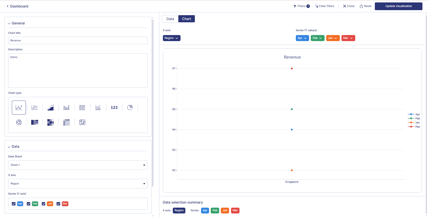
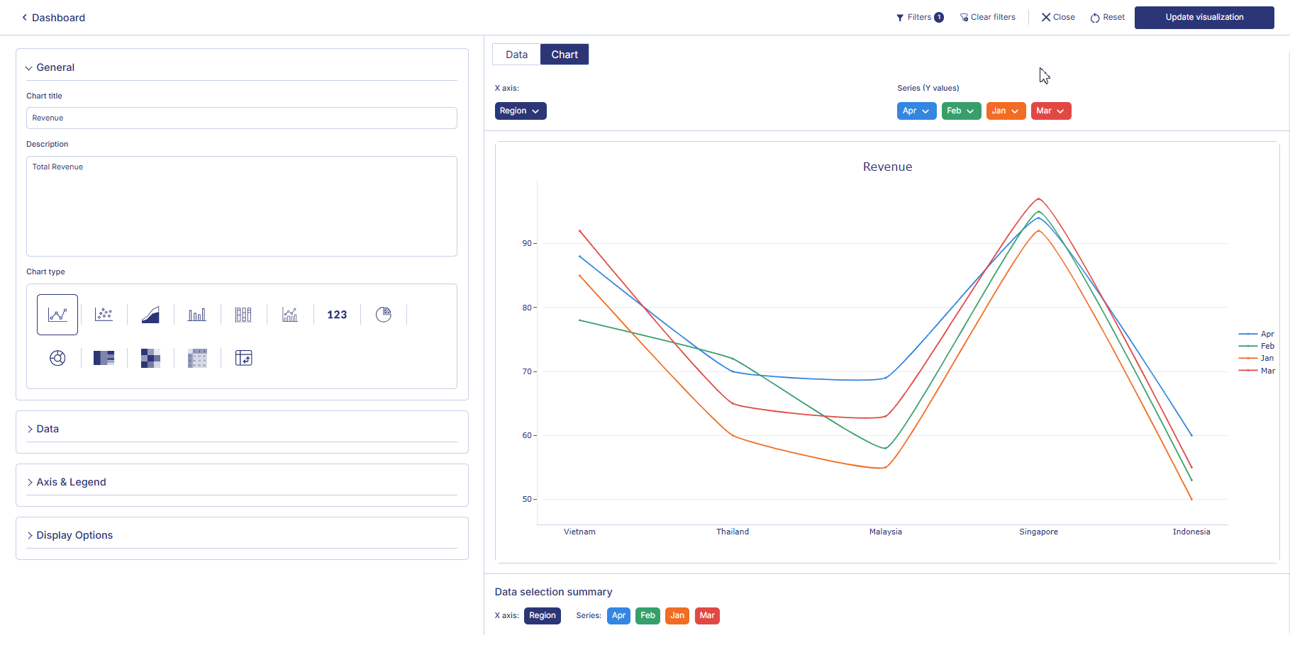
- In the General section, set the chart title, description, and select the chart type from the Point Chart group.
- In the Data section, choose the datasheet, configure the X axis, and assign one or more Series for the Y axis.
- In Axis and Legend, set labels, define value ranges, and choose the legend position.
- In Display options, adjust styling options such as line thickness, point size, bar appearance, or area opacity (depending on the point chart type).
- (Optional) Enable Key Performance Indicator (KPI) mode to display performance metrics, including KPI titles, alignment, ratios, or inverted trend colors. All changes are reflected instantly in the preview.
4. Save the chart
Once all configurations are complete:- Review the chart preview to ensure it reflects the correct filtered Workbook data.
- Click Create visualization in the top-right corner.
- The chart will be saved and added to your dashboard, where you can resize or reposition it as needed.
 Point chart group consists of charts such as line chart, area chart, scatter plot, bar chart and stacked bar chart.
Line chart
Line charts are useful for showing trends over time and comparing data series. Whether tracking sales performance, monitoring website traffic, or analyzing financial data, line charts offer a clear and intuitive representation of temporal changes. With our platform, users can effortlessly create and customize line charts to suit their specific needs. Apply filters such as line filter or chart filters or functions to create the perfect point chart you need.How to create a line chart?
- Choose a dashboard from the sidebar and switch to edit mode. Add a row, then add a visualization container to your dashboard. Select Data visualization and click Create to open the visualization page.
- Choose a table from the catalog and double-click the column names you want to use. The selected columns will be added directly into the Data table.
- To apply an aggregate, click the three-dots button on a column and select Aggregates. The aggregated value will appear in the Datasheet. To filter data, click the column you want to filter, choose Filter on this column, select a filter type, then click Apply. If you create a chart while filters are applied, the chart will display only the filtered values.
- Click Chart to configure your visualization. In the General section, set the chart title and description and choose the chart type. In the Data section, choose the data sheet, configure the X axis, and assign Series for the Y axis. In Axis and Legend, set the X-axis title, start and end values, define the Y-axis title, and choose the legend position. In Display Options, adjust the line thickness and point size. The Key Performance Indicator section is off by default; you may turn it on to choose the line, set the KPI title and subtitle, select alignment, enable ratio, or enable inverted trend colors. All configuration changes in the Chart tab are reflected immediately in the chart preview.
- When you finish configuring the chart, click Create visualization in the top-right corner of the page. Your line chart will be saved and displayed on the dashboard.
 Follow the similar steps to create an area chart, scatter plot, bar chart and stacked bar chart.
How to convert a line chart into other point charts?
As mentioned earlier, charts are divided into multiple groups. Dividing the charts under multiple groups allows the user to convert a chart to a different chart from under the same group. It is true for the point chart group. For example, if you create a line chart, you can convert it into another chart such as area chart, scatter plot, bar char or stacked bar chart, just with one click, because they all fall under the same group. Follow the steps below to convert point charts: Hover over a point chart container from the dashboard. Three dot will appear on the top right hand corner of the visualization container. Click on the three dots and an option menu will appear. Click on ‘edit’ from the option menu. From the side bar, under chart types, from the point charts group, click on either area chart, scatter plot, bar chart, stacked bar chart. In the chart visualization container you can see the chart converting depending on what you choose. Click on the Create visualization button from the top right corner of the page to save the chart. Your visualizations is saved and displayed on the dashboard.
How to edit a point chart?
Follow the steps below to edit point charts:- Hover over a point chart container from the dashboard. Three dot will appear on the top right hand corner of the chart container. Click on the three dots and an option menu will appear. Click on ‘edit’ from the option menu.
- After making the chages to the chart, click on change table from the top right corner of the page. Your chart changes is saved and chart is displayed on the dashboard.
How to delete a point chart?
Follow the steps below to delete point charts:- Hover over a point chart container from the dashboard. Three dot will appear on the top right hand corner of the chart container.
- Click on the three dots and an option menu will appear. Click on ‘Delete’ from the option menu. Click on ‘Delete’ to confirm your choice. Your chart is permanently deleted.
 In the next page we are going to walk you through how you can create a heapmap in Anlytic platform.