> ## Documentation Index
> Fetch the complete documentation index at: https://docs.anlytic.com/llms.txt
> Use this file to discover all available pages before exploring further.
# Icicle chart
In this chapter we are going to walk you through how you can create an icicle chart using the Anlytic platform.
Icicle charts are useful for highlighting proportions. Whether you're analyzing market shares, budget allocations, or survey responses, icicle charts offer an intuitive way to showcase proportions and percentages within a dataset. With our intuitive drag-and-drop interface, users can effortlessly import their data and generate icicle charts in a matter of seconds.
## How to create an icicle chart
### 1. Configure your Workbook
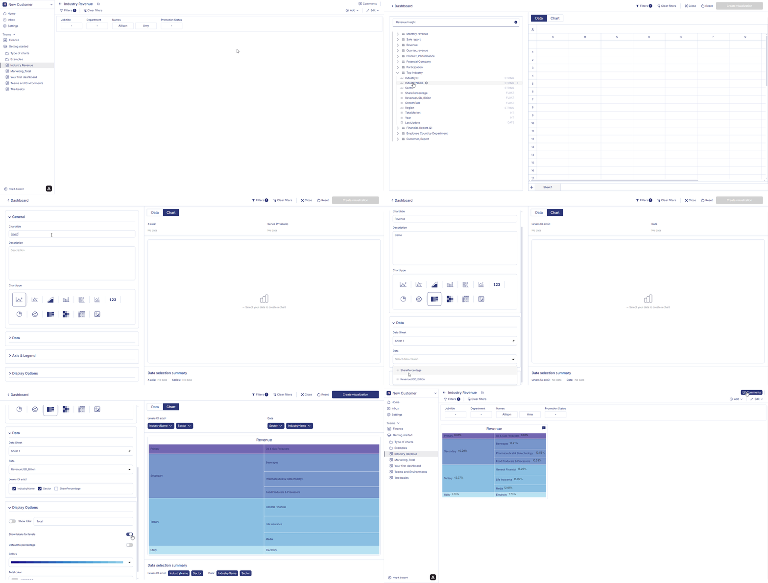
1. Open your dashboard, switch to **Edit mode**, then click **Add container**.
2. Select **Data visualization** and click **Create** to open the chart builder.
3. Choose a dataset from the catalog panel and double-click the column names you want to use.\
The selected columns will appear in the **Workbook**, where you can prepare your hierarchical dataset for the icicle chart.
### 2. Apply Groupby
Icicle charts rely on a hierarchical structure. To build this structure, you should apply **Groupby** based on the levels of your hierarchy (level 1, level 2, level 3, etc.) and optionally apply **Aggregation** for numeric values.
#### Groupby Levels
1. Click the **header** of the column you want to use as **Level 1** of the hierarchy.
2. Select **Group by this column**.
3. Repeat this process for **Level 2**, **Level 3**, or any additional hierarchy levels you want to include.\
For example:
* Level 1: Country
* Level 2: Region
* Level 3: Category
### 3. Configure your chart
1. Open your dashboard, switch to **Edit mode**, and add a new visualization container.
2. Select **Data visualization** and click **Create** to open the chart builder.
3. Choose a dataset from the catalog and verify that Workbook filters, groupby levels, and aggregations have been applied correctly.
4. In the **General** section, set the chart title and description, then select **Icicle chart** as the chart type.
5. In the **Data** section, choose the datasheet, select the **Data field** (numeric value used to size the blocks), and choose the **Levels** fields that define the hierarchy of the icicle chart.
6. In **Display options**, configure totals, labels, and colors:
* **Show total**: toggle on/off and rename the total label if needed.
* **Show labels for levels**: toggle to display level names directly inside chart segments.
* **Default to percentage**: toggle to display values as percentages instead of absolute values.
* **Colours**: customize the color palette for each level; also specify a **Total color** if totals are enabled.\
All changes are applied instantly in the preview.
***
### 4. Save the chart
Once all configurations are complete:
1. Review the chart preview to ensure the hierarchy and values are displayed correctly.
2. Click **Create visualization** in the top-right corner.
3. The icicle chart will be saved and added to your dashboard, where you can resize or reposition it as needed.
 ## How to edit an icicle chart?
Follow the steps below to edit icicle chart:
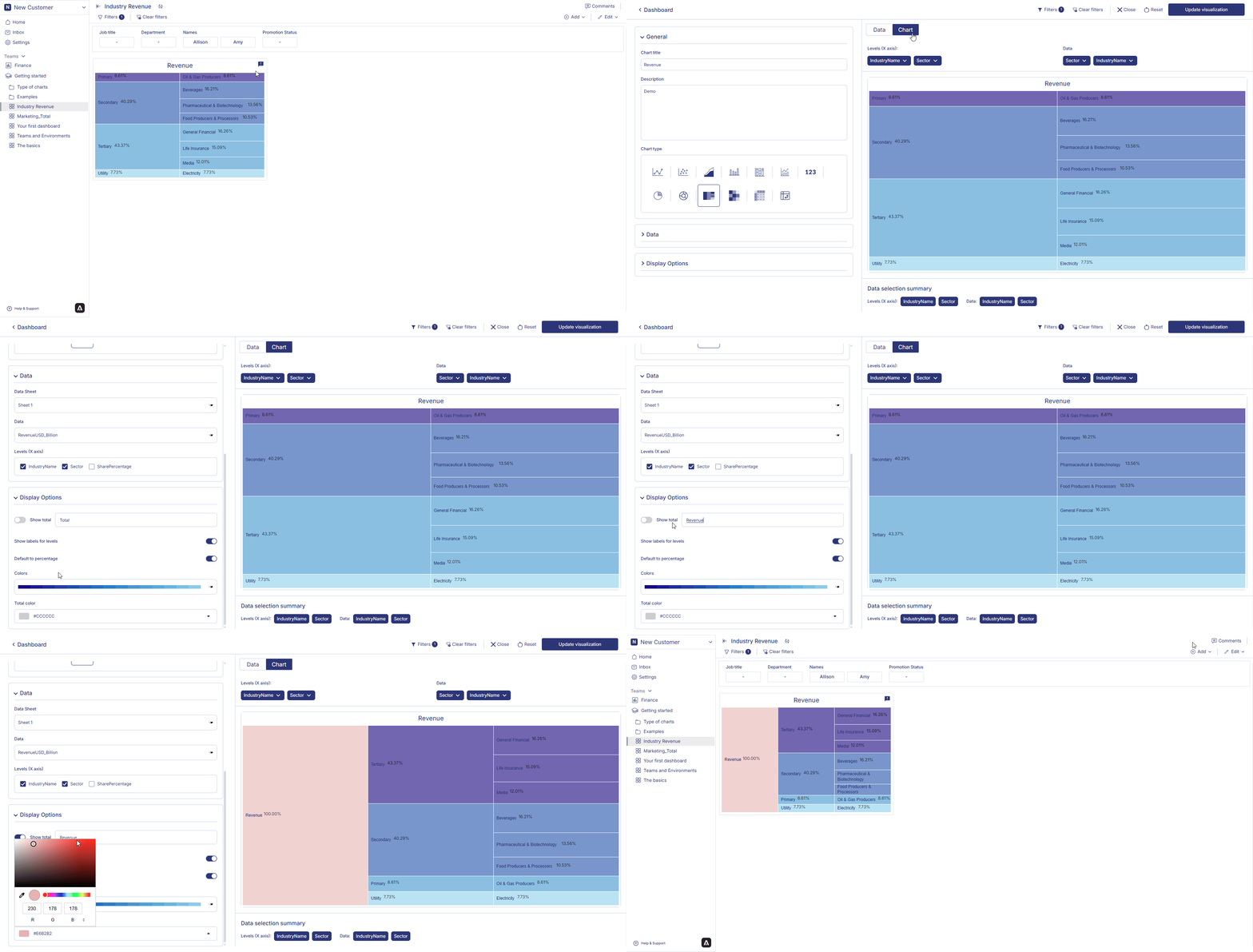
1. Hover over an icicle chart container from the dashboard. Three dots will appear on the top right hand corner of the chart container. Click on the three dots and an option menu will appear. Click on 'edit' from the option menu.
2. After making the chages to the chart, click on change table from the top right corner of the page. Your chart changes is saved and chart is displayed on the dashboard.
## How to edit an icicle chart?
Follow the steps below to edit icicle chart:
1. Hover over an icicle chart container from the dashboard. Three dots will appear on the top right hand corner of the chart container. Click on the three dots and an option menu will appear. Click on 'edit' from the option menu.
2. After making the chages to the chart, click on change table from the top right corner of the page. Your chart changes is saved and chart is displayed on the dashboard.
 ## How to delete an icicle chart?
Follow the steps below to delete icicle chart:
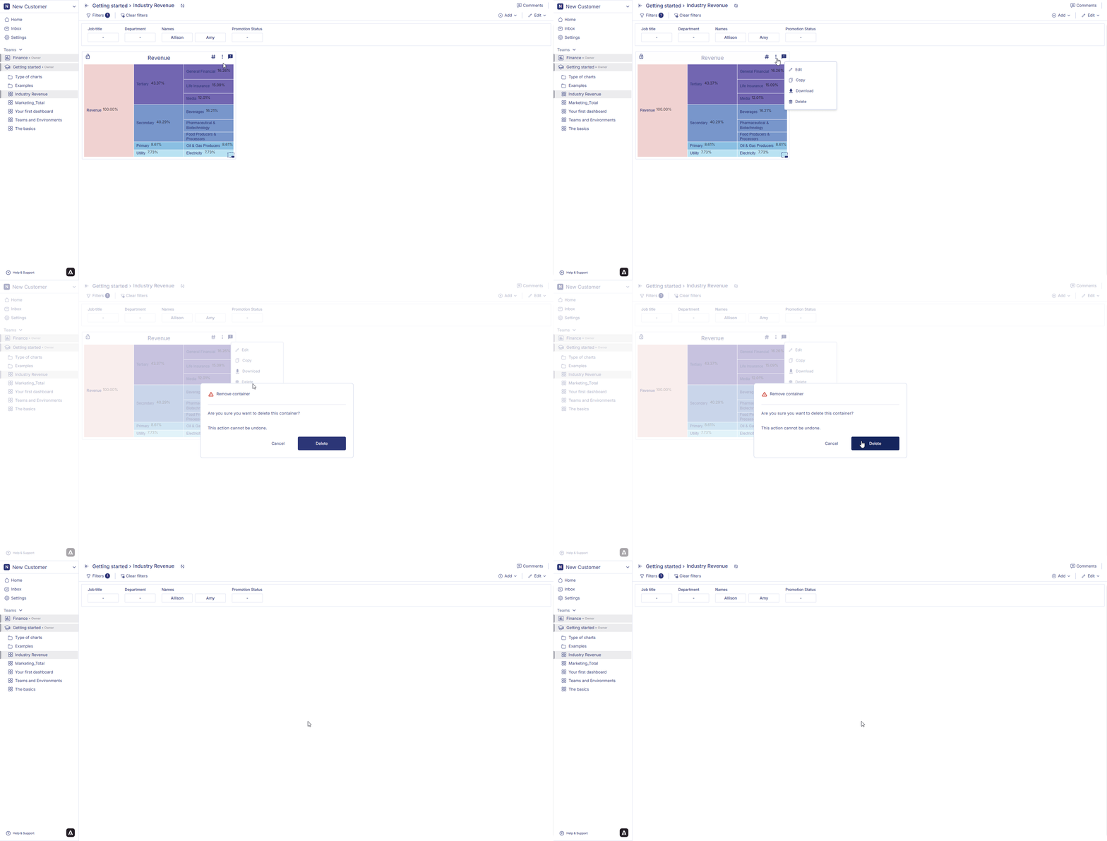
1. Hover over an icicle chart container from the dashboard. Three dots will appear on the top right hand corner of the chart container. Click on the three dots and an option menu will appear.
2. Click on 'delete' from the option menu. Click on delete to confirm your choice. Your chart is permanently deleted.
## How to delete an icicle chart?
Follow the steps below to delete icicle chart:
1. Hover over an icicle chart container from the dashboard. Three dots will appear on the top right hand corner of the chart container. Click on the three dots and an option menu will appear.
2. Click on 'delete' from the option menu. Click on delete to confirm your choice. Your chart is permanently deleted.
 In next page we are going to walk you through how you can create a [headline statistics](headline).