> ## Documentation Index
> Fetch the complete documentation index at: https://docs.anlytic.com/llms.txt
> Use this file to discover all available pages before exploring further.
# Heatmap
In this page we are going to walk you through how you can create heatmaps with Anlytic platform.
Heatmap is a powerful tools for representing complex data sets in a visually intuitive manner. Heatmaps offer a graphical representation of data where values are depicted using colors, with each color representing a different level of intensity or magnitude.
## How to create a heatmap
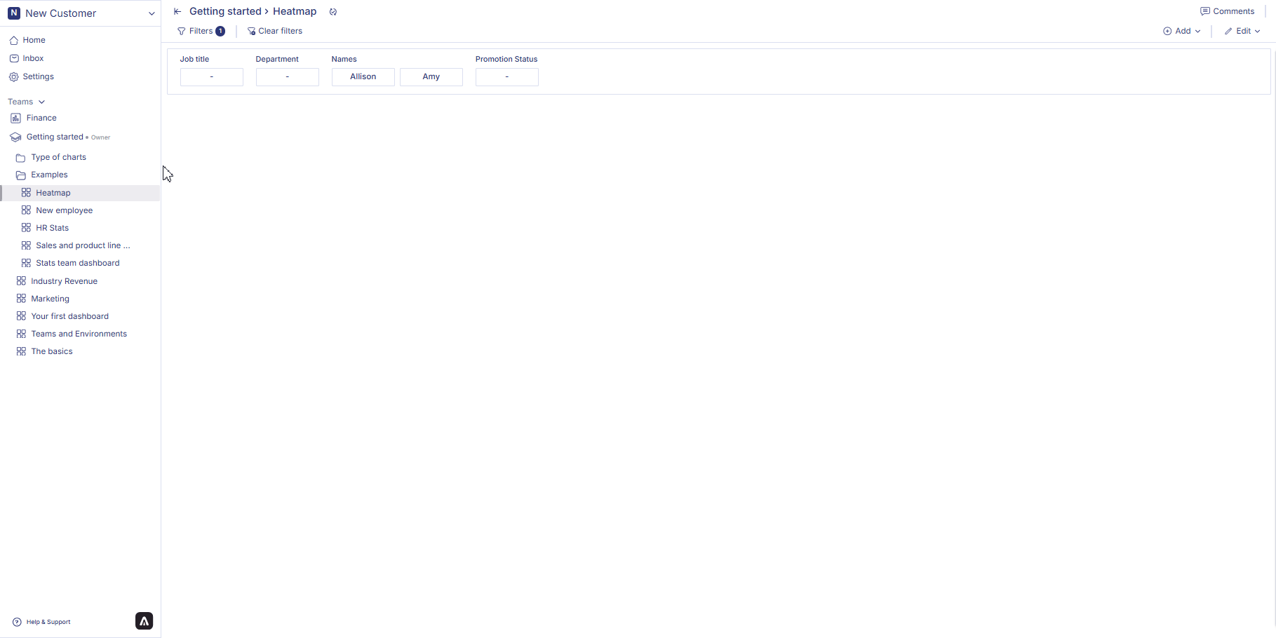
### 1. Configure your Workbook
1. Open your dashboard, switch to **Edit mode**, then click **Add container**.
2. Select **Data visualization** and click **Create** to open the chart builder.
3. Choose a dataset from the catalog panel and double-click the column names you want to use.\
The selected columns will appear in the **Workbook**, where you can prepare your dataset for the heatmap.
### 2. Apply Groupby and Aggregation
Heatmaps often require summarized data, especially when the same X–Y combinations appear multiple times. Use **Groupby** and **Aggregation** to prepare the dataset:
#### Groupby
1. Click the **header** of the column you want to group by.
2. Select **Group by this column**.
3. Repeat if you want to group by multiple fields (e.g., Region + Category).
#### Aggregation
1. Click the **⋮** button on a numeric column.
2. Select an aggregation method, such as: Count, Sum, Average, Minimum, Maximum
3. The aggregated result will appear immediately in the Workbook.
Your heatmap will be built using this grouped and aggregated dataset.
### 3. Configure your chart
1. Open your dashboard, switch to **Edit mode**, and add a new visualization container.
2. Select **Data visualization** and click **Create** to open the chart builder.
3. Choose a dataset from the catalog and verify that Workbook filters, groupby, and aggregations have been applied correctly.
4. In the **General** section, set the chart title and description, then select **Heatmap** as the chart type.
5. In the **Data** section, choose the datasheet, select the **Data field** to represent value intensity, and configure the **X axis** and **Y axis** by selecting the appropriate fields.
6. In **Axis and Legend**, configure axis types and sorting orders for both X and Y to control how the heatmap grid is arranged.
7. In **Display options**, customize the Colours panel by choosing gradient scales or preset color palettes to represent value intensity. All changes are reflected instantly in the chart preview.
### 4. Save the chart
Once all configurations are complete:
1. Review the chart preview to ensure it reflects the correct grouped, aggregated, and filtered Workbook data.
2. Click **Create visualization** in the top-right corner.
3. The chart will be saved and added to your dashboard, where you can resize or reposition it as needed.
 ## How to edit a heatmap?
Follow the steps below to edit heatmap:
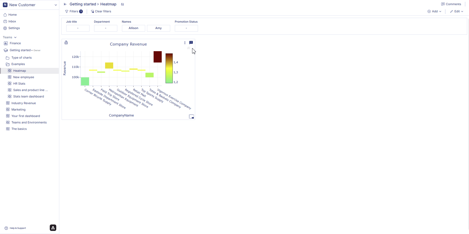
1. Hover over a heatmap container from the dashboard. Three dot will appear on the top right hand corner of the chart container. Click on the three dots and an option menu will appear. Click on 'edit' from the option menu.
2. After making the chages to the chart, click on change table from the top right corner of the page. Your chart changes are saved and chart is displayed on the dashboard.
## How to edit a heatmap?
Follow the steps below to edit heatmap:
1. Hover over a heatmap container from the dashboard. Three dot will appear on the top right hand corner of the chart container. Click on the three dots and an option menu will appear. Click on 'edit' from the option menu.
2. After making the chages to the chart, click on change table from the top right corner of the page. Your chart changes are saved and chart is displayed on the dashboard.
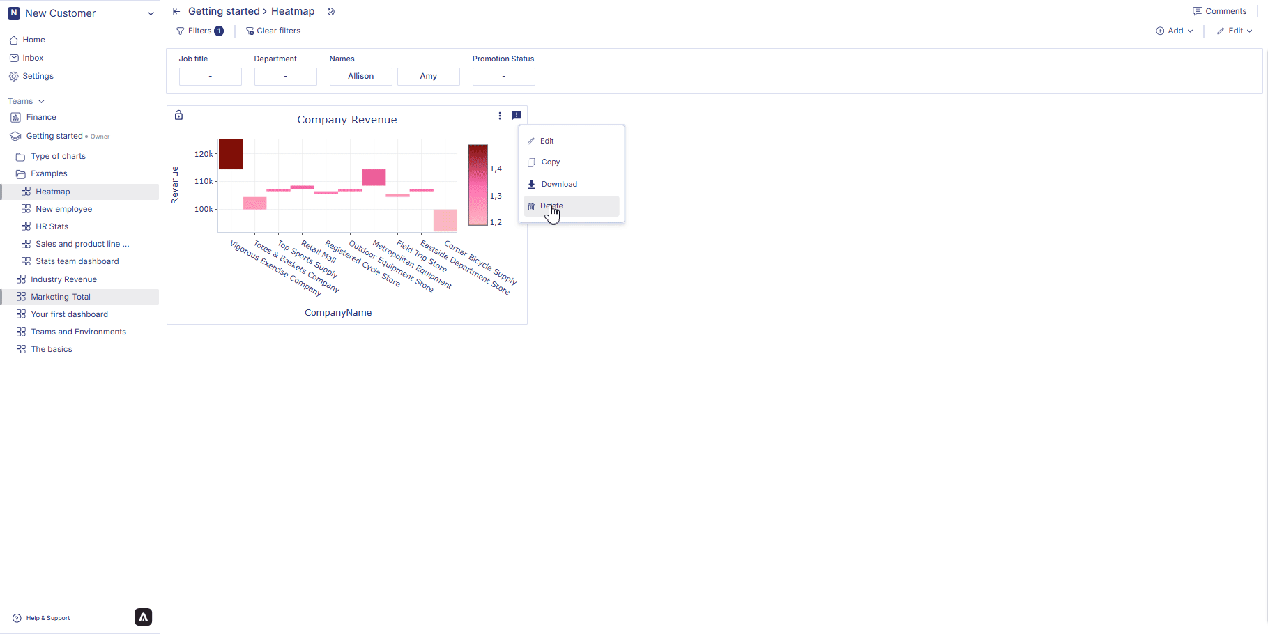
 ## How to delete a heatmap?
Follow the steps below to delete heatmap:
Hover over a heatmap container from the dashboard. Three dot will appear on the top right hand corner of the chart container. Click on the three dots and an option menu will appear. Click on 'delete' from the option menu. Click on delete to confirm your choice. Your chart is permanently deleted.
## How to delete a heatmap?
Follow the steps below to delete heatmap:
Hover over a heatmap container from the dashboard. Three dot will appear on the top right hand corner of the chart container. Click on the three dots and an option menu will appear. Click on 'delete' from the option menu. Click on delete to confirm your choice. Your chart is permanently deleted.
 In the next page we are going to walk you through how you can create an [icicle chart](icicle) in Anlytic platform.