In this chapter we are going to walk you through how you can create geographical visualizations using the Anlytic platform’s Geo Map feature.
Geo Maps are powerful tools for visualizing location-based data, allowing you to display patterns, trends, and distributions across geographical areas. Whether you’re analyzing sales by region, tracking logistics routes, or visualizing population density, geo maps provide an intuitive way to understand spatial relationships in your data.
Overview
The Geo Map chart type supports multiple visualization styles:
- Point-based visualizations - Display individual data points on a map using scatter plots or heatmap layers
- Path and Arc visualizations - Show connections and routes between locations
- Custom geographical layers - Visualize polygons and custom geographical boundaries
Before creating a geo map, you need to ensure your data includes geographical information. This can be in the form of coordinates (latitude/longitude) or geographical labels that are mapped to coordinate data.
Setting Up Geographical Data
Marking Columns as Geographical Labels
To use geographical data in your visualizations, you first need to configure your data columns with geographical metadata:
-
Navigate to Data Management in the sidebar and select Data Sources.
-
Choose the data source that contains your geographical data and click on Metadata.
-
Locate the column that contains geographical information (such as country names, city names, or region codes).
-
In the metadata configuration for that column, you’ll see an option Mark as geographical label. Enable this checkbox.
-
Once enabled, additional mapping options will appear:
Standard Mapping:
- Select Geo column
- Choose the system geographical column that contains the coordinate data (e.g., “Countries”, “US States”, “World Cities”)
- Select Label column
- Choose the column in the geo dataset that matches your data (e.g., country names, state codes)
Map via ID (Advanced):
- Toggle Map via id if you want to map using an identifier column
- Select ID column
- Choose the column in your data that contains the unique identifier
- Select Geo column
- Choose the geographical system column
- Select Reference column
- Choose the column in the geo dataset that matches your ID
-
Click Deploy to save the geographical mapping configuration.
 This configuration allows the platform to automatically convert your geographical labels into coordinates that can be displayed on a map.
Understanding Geographical Data Types
The platform supports two main types of geographical data:
- Point Data (Coordinates)
- Latitude and longitude values that represent specific locations
- Polygon Data (Boundaries)
- Geographical shapes that represent areas like countries, states, or custom regions
When you mark a column as a geographical label, the system automatically determines the appropriate data type and provides the correct visualization options.
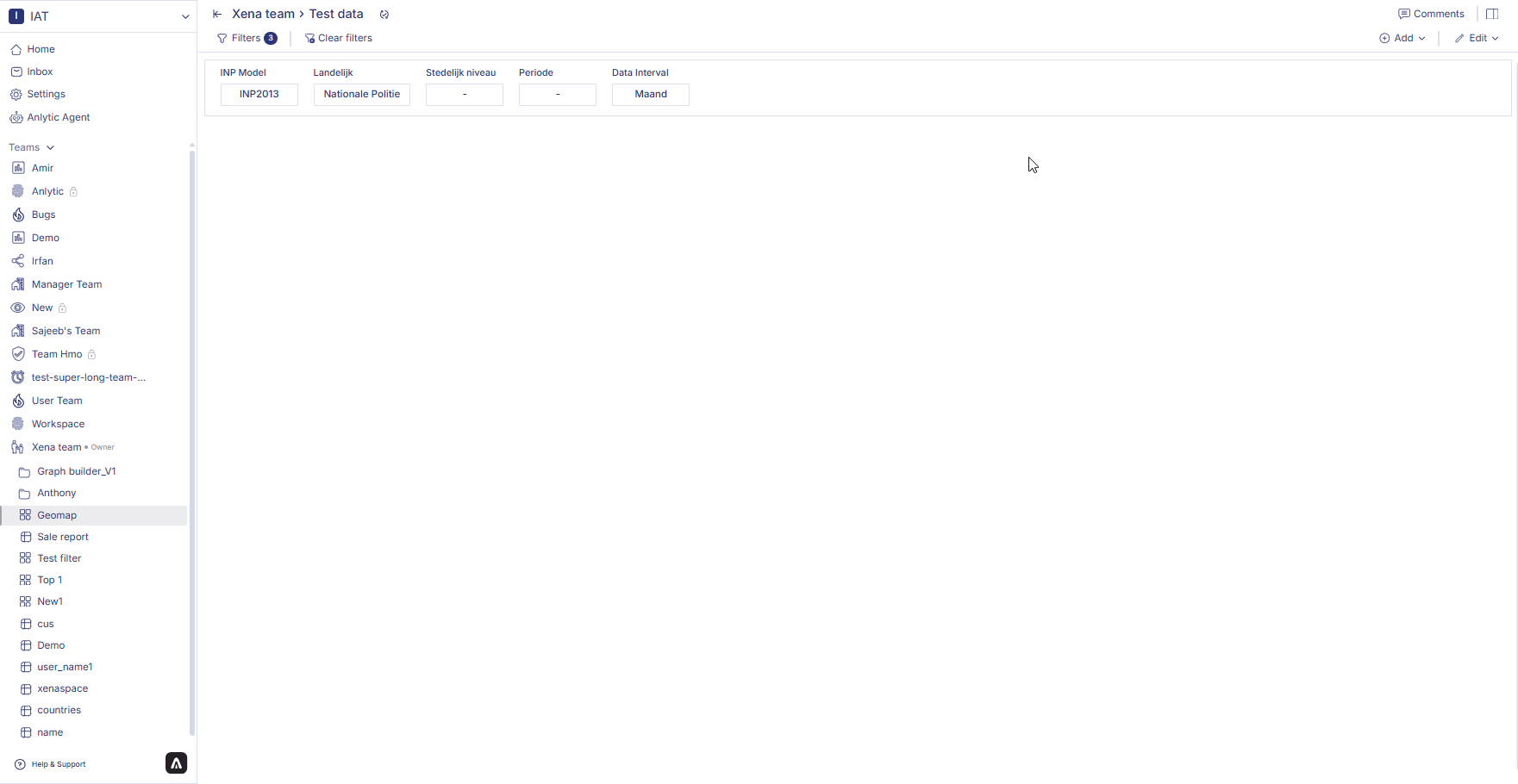
How to Create a Geo Map?
- Open your dashboard, switch to Edit mode, then click add container.
- Select Data visualization and click Create to open the chart builder.
- Choose a dataset from the catalog panel and double-click the column names you want to use. The selected columns will appear in the Workbook.
- Open your dashboard, switch to Edit mode, and add a new visualization container.
- Select Data visualization and click Create to open the chart builder.
- Choose a dataset from the catalog and verify that Workbook filters have been applied correctly.
- In the General section, set the chart title, description, and select the Geomap chart type.
- In the Data section, choose the datasheet, select the Label field, assign the Data (geo identifier), and configure Custom Geometry if needed.
- In Display options, configure map styling such as enabling the map background, toggling dark mode, adjusting opacity, selecting color gradients, and optionally enabling 3D extrusion with elevation scale controls.
4. Save the chart
Once all configurations are complete:
- Review the chart preview to ensure it reflects the correct filtered Workbook data.
- Click Create visualization in the top-right corner.
- The chart will be saved and added to your dashboard, where you can resize or reposition it as needed.
How to Edit a Geo Map?
Follow these steps to edit an existing geo map:
-
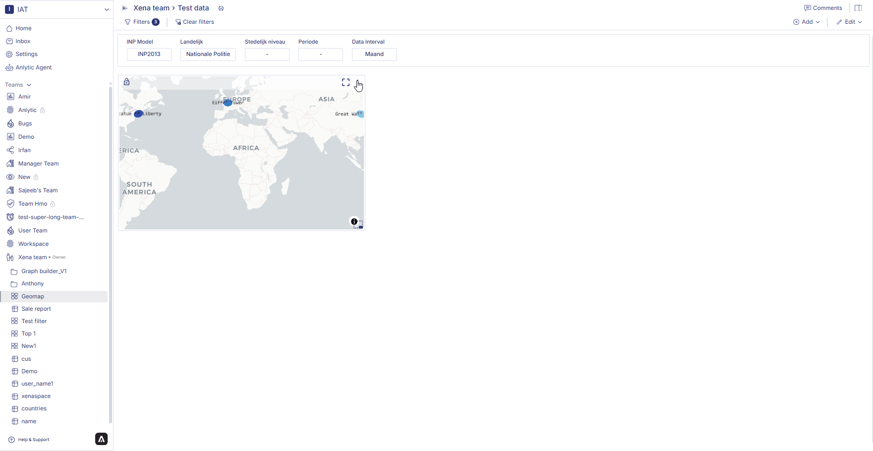
Hover over the geo map container on your dashboard. Three dots will appear in the top right corner of the chart container. Click on the three dots to open the options menu.
-
Click on Edit from the options menu. This will take you to the chart builder with your current configuration loaded.
-
Make changes to your data, layer type, or display options:
- Switch between different layer types to see different visualizations
- Adjust colors, sizes, and opacity settings
- Add or remove data fields
- Modify filters to focus on specific regions or data points
-
After making your changes, click Update visualization in the top-right corner of the page. Your updated geo map will be saved and displayed on the dashboard.
How to Delete a Geo Map?
Follow these steps to delete a geo map:
-
Hover over the geo map container on your dashboard. Three dots will appear in the top right corner of the chart container. Click on the three dots to open the options menu.
-
Click on Delete from the options menu.
-
A confirmation dialog will appear. Click Delete to confirm your choice. Your geo map will be permanently removed from the dashboard.
Advanced Geo Map Features
Applying Filters to Geo Maps
Like other visualizations, you can apply filters to geo maps to focus on specific regions or data subsets:
-
In the chart builder, click on a column in the Data tab to apply a filter.
-
Configure the filter criteria (e.g., show only specific countries, date ranges, or value thresholds).
-
The map will update to show only the filtered data points.
Filters are particularly useful for geo maps when you want to:
- Zoom in on specific geographical regions
- Filter by time periods to show temporal changes
- Display only data points that meet certain criteria
Using Aggregates with Geo Maps
You can apply aggregates to columns before using them in geo maps:
-
In the Data tab, click the three dots next to a numeric column.
-
Select an aggregate function (Sum, Avg, Count, etc.).
-
The aggregated column will appear in your Data tab and can be used for the Size or Color fields in your geo map.
This is useful for creating maps that show summarized data, such as total sales by city or average temperatures by region.
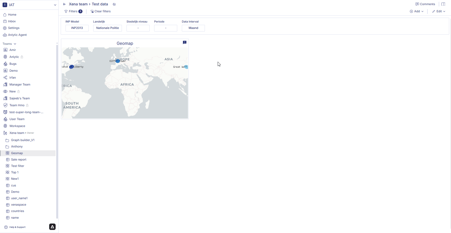
Interactive Map Features
When viewing a geo map on your dashboard:
- Pan - Click and drag to move around the map
- Zoom - Use the mouse wheel or pinch gesture to zoom in and out
- Hover - Hover over data points to see detailed information in tooltips
- Full screen - Click the full-screen icon to expand the map for detailed exploration
Tips for Effective Geo Maps
-
Choose the Right Layer Type - Use scatterplot for individual locations, heatmap for density visualization, and path/arc layers for showing connections.
-
Configure Geographical Metadata Properly - Ensure your geographical labels are correctly mapped to coordinate data for accurate positioning.
-
Use Color and Size Meaningfully - Leverage the color and size fields to encode additional dimensions of data on your map.
-
Adjust Opacity for Overlapping Points - When you have many overlapping points, reducing opacity helps reveal the density of data.
-
Test Different Map Themes - Try both light and dark map themes to see which provides better contrast for your data.
-
Apply Filters for Regional Focus - Use filters to create multiple maps focused on different regions or time periods.
-
Consider Data Volume - Geo maps with thousands of points may perform better with heatmap layers than scatterplot layers.
Common Use Cases
Geo maps are ideal for visualizing:
- Sales Performance by Region - Show sales metrics across geographical territories
- Store or Branch Locations - Display the distribution of physical locations
- Logistics and Shipping Routes - Visualize transportation paths and connections
- Demographic Analysis - Show population, income, or other demographic patterns
- Event Tracking - Display the locations and distribution of events over time
- Resource Distribution - Visualize the allocation of resources across regions
- Customer Geography - Understand where your customers are located
By mastering geo maps, you can unlock powerful spatial insights from your data and create compelling visualizations that help stakeholders understand geographical patterns and trends.
In the next section, we’ll explore filters to help you interactively control what data is displayed across your dashboards. Last modified on March 13, 2026