In this section we are going to walk you through the types of charts and how you can create charts in Anlytic platform.Documentation Index
Fetch the complete documentation index at: https://docs.anlytic.com/llms.txt
Use this file to discover all available pages before exploring further.
Types of charts
By using our platform’s analysis and visualization capabilities, business users can gain valuable insights, make well-informed decisions, and fully leverage their data assets for success. Below you can see the chart group on the Anlytic platform:- Point charts - Line chart, area chart, scatter plot, bar chart and stacked bar chart.
- Heatchart - Heatmap.
- Statistics charts - Headline statistics, data table.
- Other charts - Pie chart, Geomap.
Overview of the chart creation screen
Before building a visualization, it’s important to understand the layout of the chart creation screen. Once you know where everything is located, creating charts in the Analytics dashboard becomes simple and intuitive. Once you click “Data visualization” from the dashboard’s visualization container, the system takes you to the chart creation page.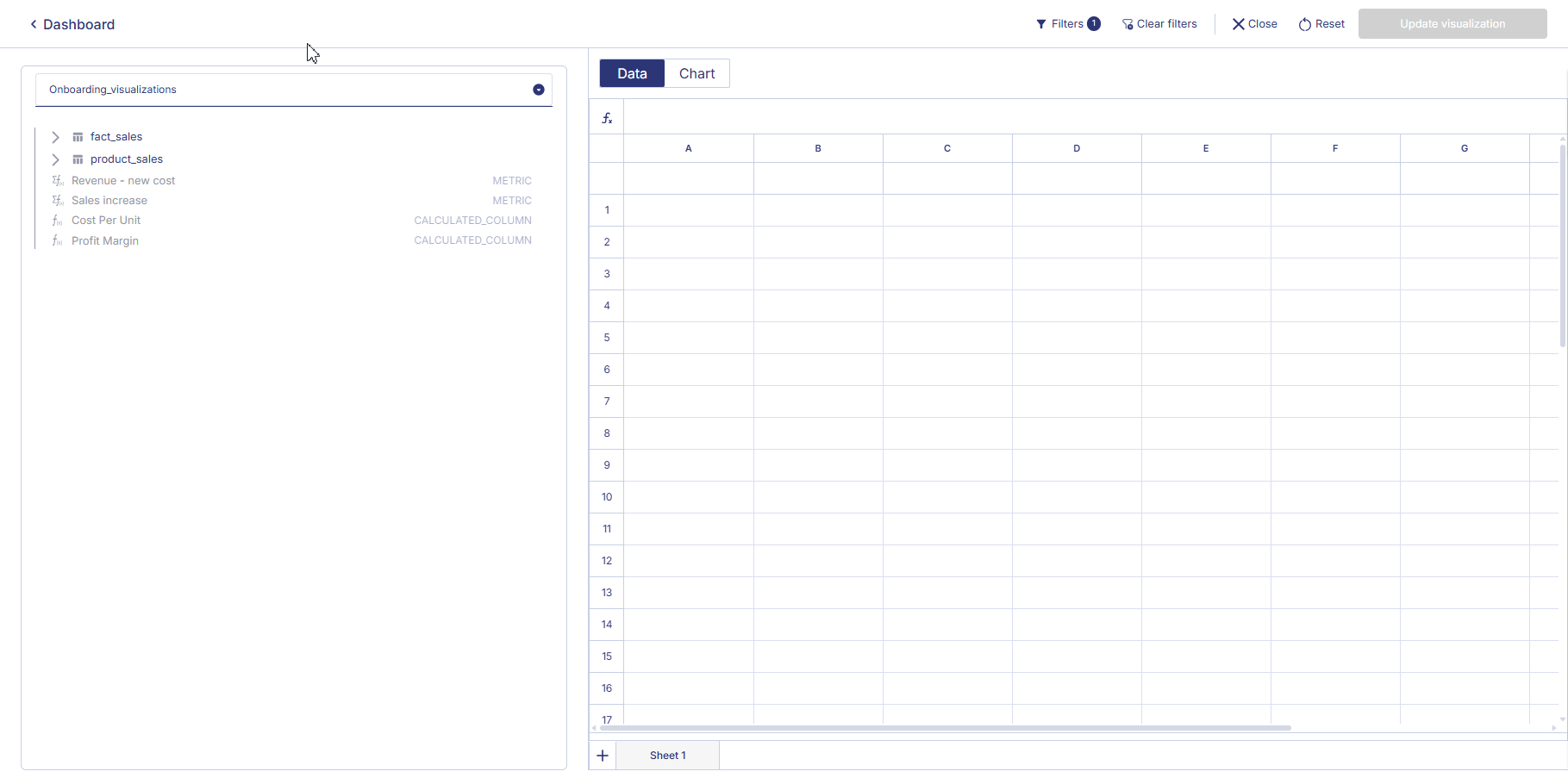 The panel on the left side of the screen is the Data panel.
This area displays the catalog that was created during the data connection step.
The panel on the left side of the screen is the Data panel.
This area displays the catalog that was created during the data connection step.You built the catalog when you created the data connection. You can toggle between catalogs by clicking on the dropdown button. To know more about the catalog read the overview page under the catalog section.
Workspace Area
The right side of the page contains your main working area, which includes two tabs: Data and Chart. This is where you prepare data and configure your visualization.Data Tab
The Data tab is where you set up the dataset that will be used for your chart. You will see:- A formula bar where you can type
=to use formulas - Column and row placeholders representing each cell
- All data that will be visualized when you switch to the Chart tab
To create an additional sheet, click the “+” button at the bottom of the Data tab. All values visible in the Data tab are available to select when configuring your chart.
Chart Tab
The Chart tab is where you define your visualization and configure how your data will be displayed.General Configuration
In the General section, you will find:- Chart title – the name of your chart
- Description – optional text to help your team understand the purpose of the chart
- Chart type selection – choose from multiple chart types depending on your needs (Line chart, Area chart, Scatter plot, Bar chart/ Stacked bar chart, Headline chart, Heatmap, Pie chart,…)
Data & Axis Configuration
Below the chart type selector, you can define how your chart uses the data:- Choose the Data sheet
- Select the X axis
- Add one or more Series (Y axis)
- Configure additional options depending on chart type
Chart Preview Area
On the far right is the chart preview, which updates instantly as you change:- The data in the Data tab
- The chart type
- Axis configuration
- Any additional settings
Top Bar Actions
At the top of the page, you will find the main controls for managing your chart:- Filters – view active filters
- Clear filters – remove all filters
- Close – exit chart creation and return to the dashboard
- Reset – clear all chart settings
- Update visualization – save the chart to your dashboard
Building a Visualization
To build your chart, simply move through the workflow naturally:- Prepare your data in the Data tab
- Switch to the Chart tab to choose a chart type
- Add a title and description
- Map your data to the X axis and Series
- Adjust chart options as needed
- Review the live preview
- Click Update visualization when you’re ready to save